Designing for cold hands, bright snow and a racing heart
What we learned watching people use Diorite at minus 15, in full sun, tired and a little scared.
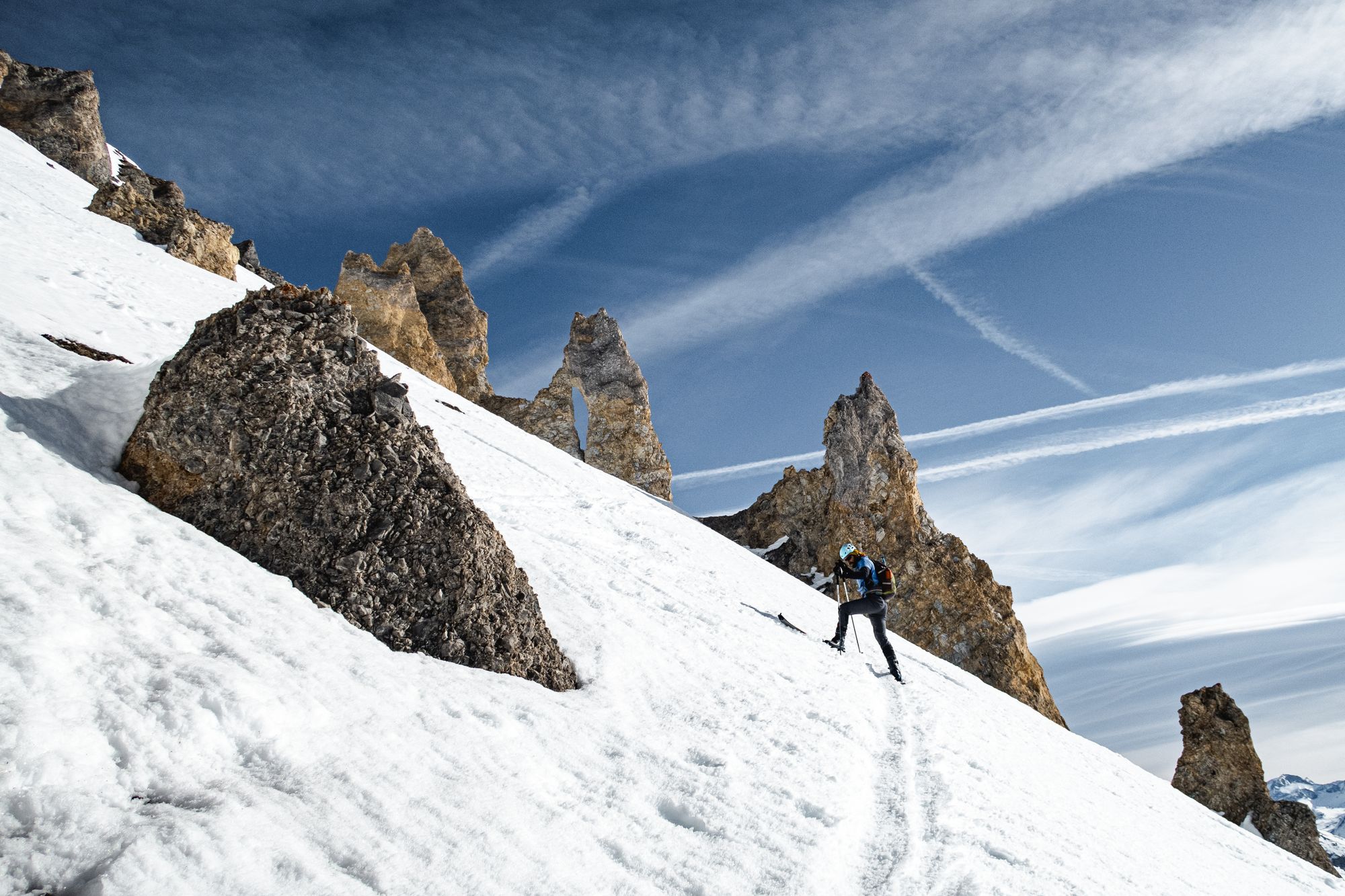
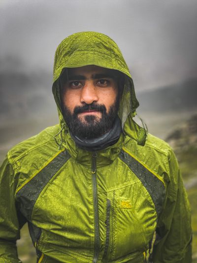
Most apps are designed at a desk, in warm light, by people who feel calm. Ours gets opened on a ridge at dawn by someone breathing hard with a mitten on one hand. Once I really understood that, almost every design decision changed.
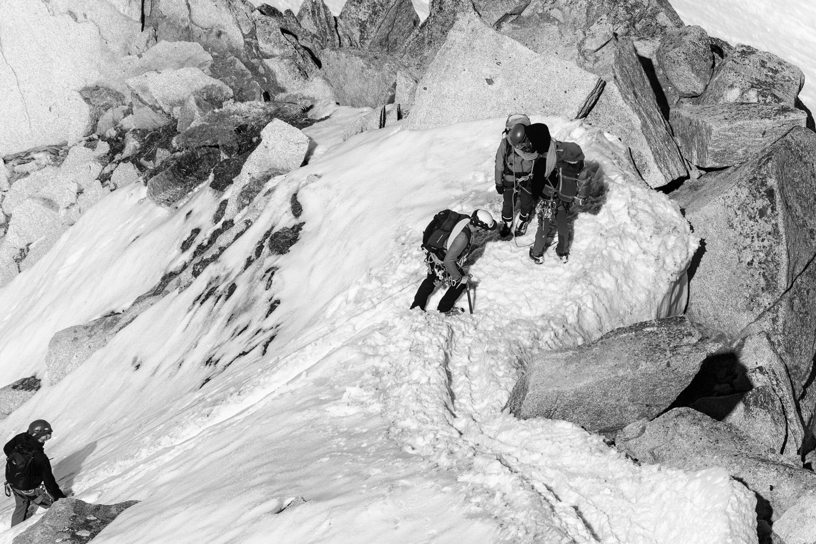
So we stopped designing indoors. This spring, our early-access members let us tag along on their trips and watch them use Diorite for real. I learned more in those weeks than in a year of screens.
Bigger buttons, fewer of them
With liner gloves on, the smallest button people could reliably tap was about the size of a thumbprint. So every main action is at least that big, and no screen asks you to choose between more than three things.
Built for bright sun on snow
Snow glare washes out soft greys completely. Field Mode uses a high-contrast look that we tested outside at noon, in June, on a glacier. Every pretty gradient we tried failed that test.
If you have to think about the app, the app is getting in the way of the mountain.
Calm words when you need them most
Fear makes your attention narrow. On the hill, our words are short and kind, and they always start with what to do next. No exclamation marks. No jokes. Just a steady voice.
Written by
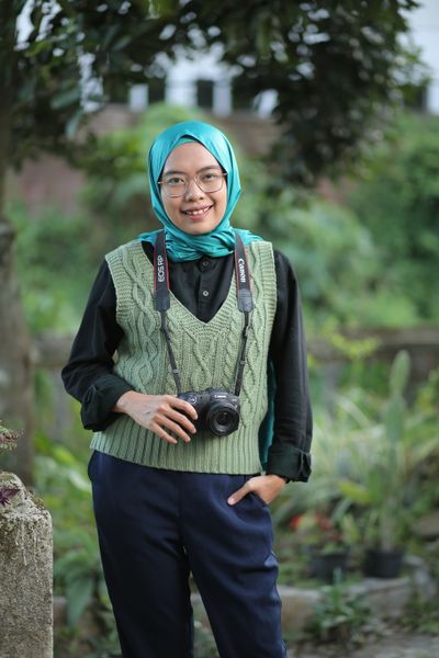
Aisha Rahman
Head of Design. Photographer and long-distance trekker.